Neutrals are back in for 2021. As we’re starting to find excitement outside of our four walls, our homes are once again becoming a calm place of sanctuary from the busy world. What better way to achieve this feeling than with peaceful neutral decor and colour schemes?
British home decor brand and paint specialists Lick, has teamed up with award-winning interior designer Kelly Hoppen CBE, known as the ‘Queen of Neutrals’, to create six timeless neutral paint colours to decorate your home with.
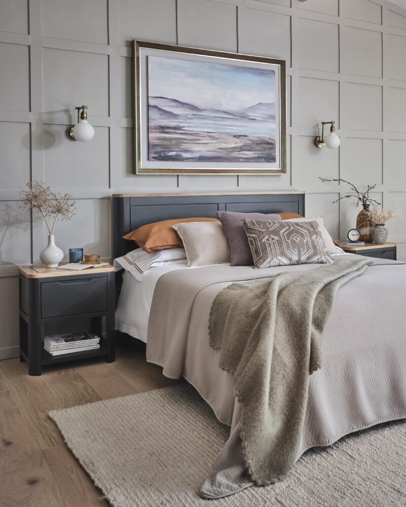
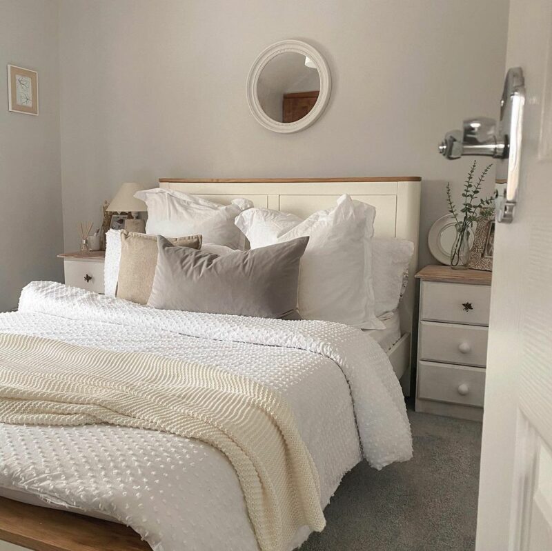
Grove bedside table | Grove double bed
Tash Bradley, Lick’s Lead Interior & Colour Specialist, said these timeless neutral paint colours, known as Palette 04, are designed to help us create ‘balance and calmness’ and ‘soothing spaces to retreat to and relax in’. Sounds good to us!
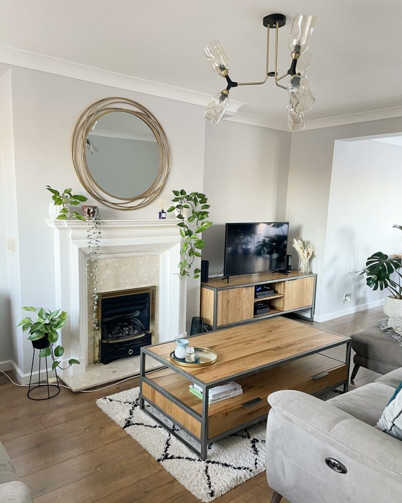
Brooklyn TV unit | Brooklyn coffee table | @kas_interiors
What is a good neutral paint colour?
A good neutral paint colour is any shade that serves as a quiet background for other elements. Neutrals are usually grey and beige, whites and browns, but very light shades can be neutrals even if they have a hint of colour in them.
Neutral paint colours are a reliable option for any room if you’re looking to create a calming and tranquil space. Kelly Hoppen has long been an avid lover and advocate of neutral palettes. She said: “I love using them because they provide the perfect, quiet, easy backdrop for so many looks, materials and styles of furniture and furnishings.” Neutral colours are super easy to pair with other shades to create exactly the look you want.
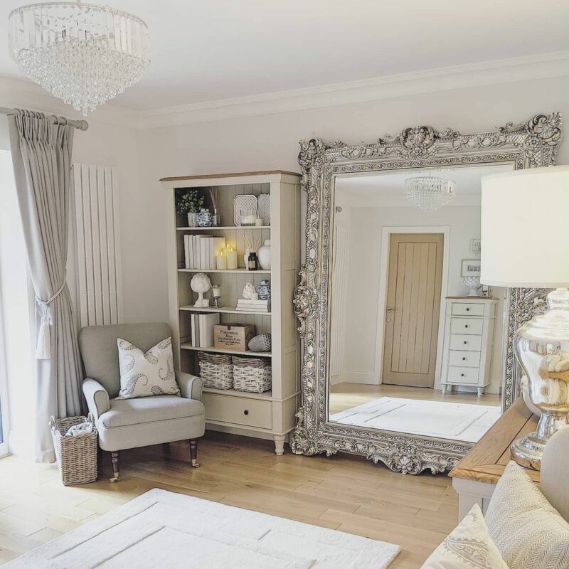
Shay Bookcase | @mrs_roobottoms_home
Kelly Hoppen x Lick
We love this collaboration because Kelly Hoppen is such a veteran of creating perfect neutral interiors. She’s done the hard work for us by choosing this palette, which she said ”offers a truly timeless appeal that will work with every home design.” Here are our favourites from the collection and tips on how you can style them in your home.
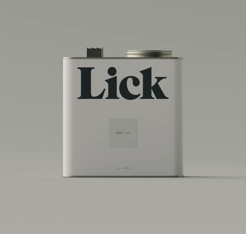
The perfect light grey paint
Light grey is the ultimate neutral shade because its lightness provides a comforting and calm backdrop in your home. Grey 11 from the collection has subtle hints of blue, but is still light and grey enough to be a neutral colour.
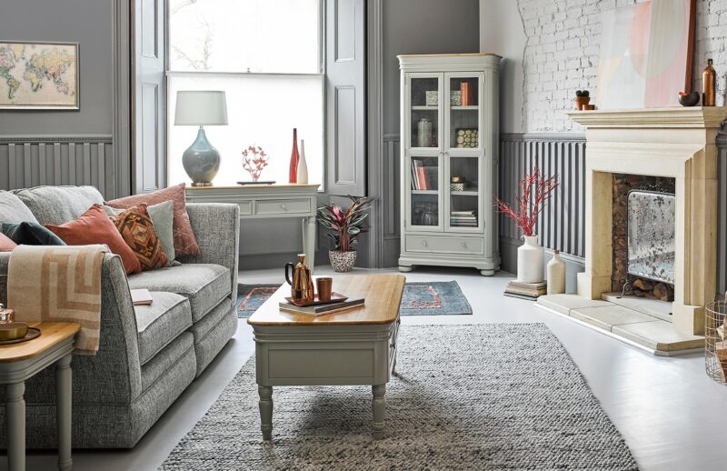
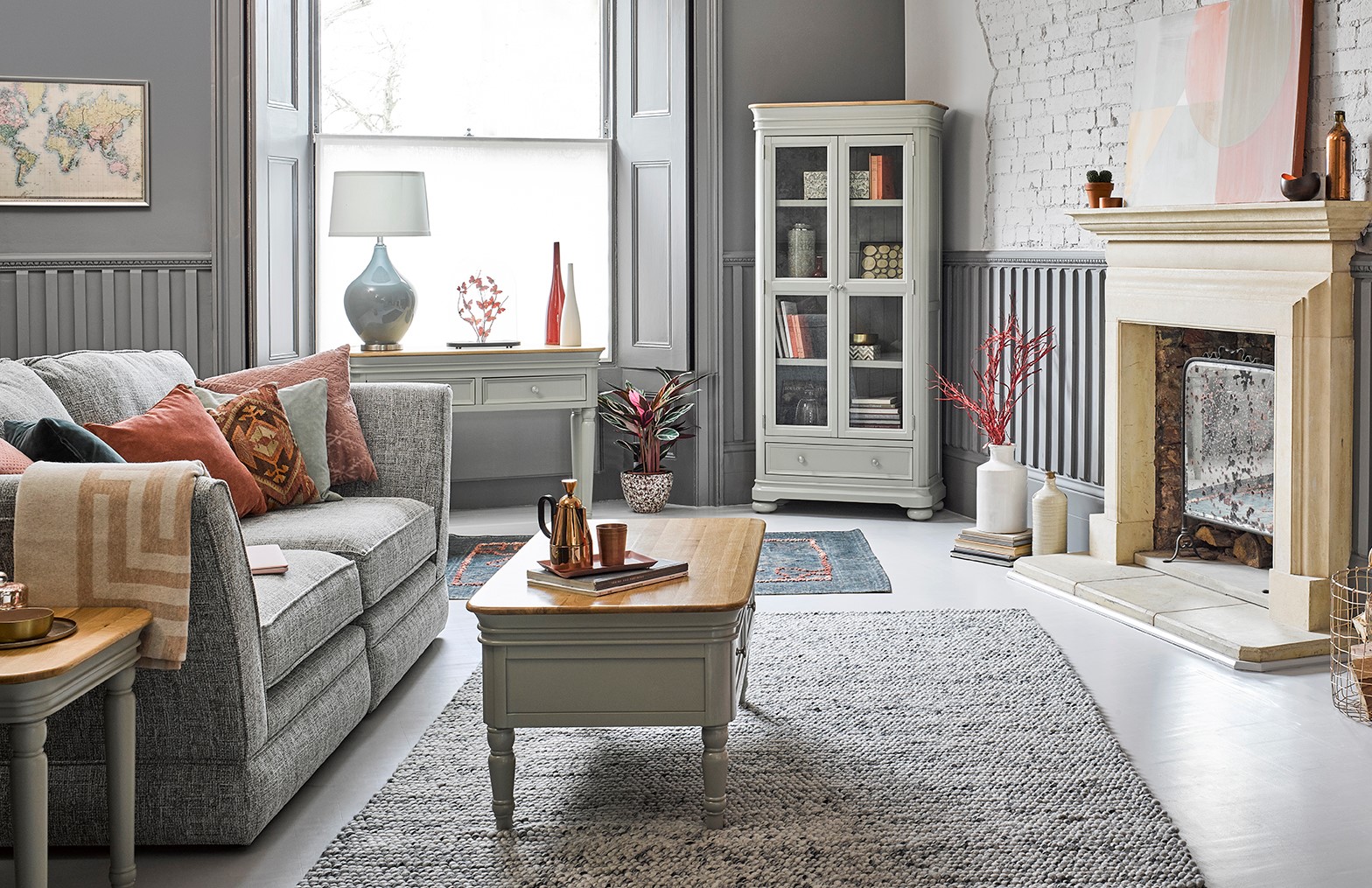
Brindle coffee table | Brindle display cabinet
To style this versatile shade, go bold and contrast it with darker tones in your interiors such as inky blue painted furniture like the Highgate range. Or for a fully neutral palette, consider matching it with some grey and white painted furniture. For more inspiration, check out our blog on how to style grey and white painted furniture.
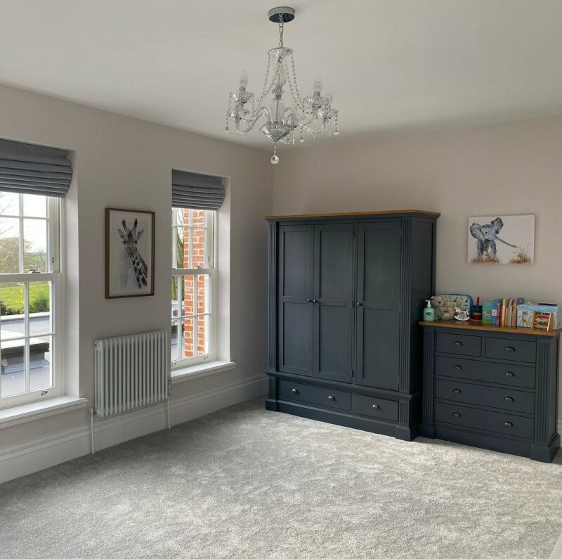
Highgate triple wardrobe | Highgate 5 drawer chest | @merford_manor
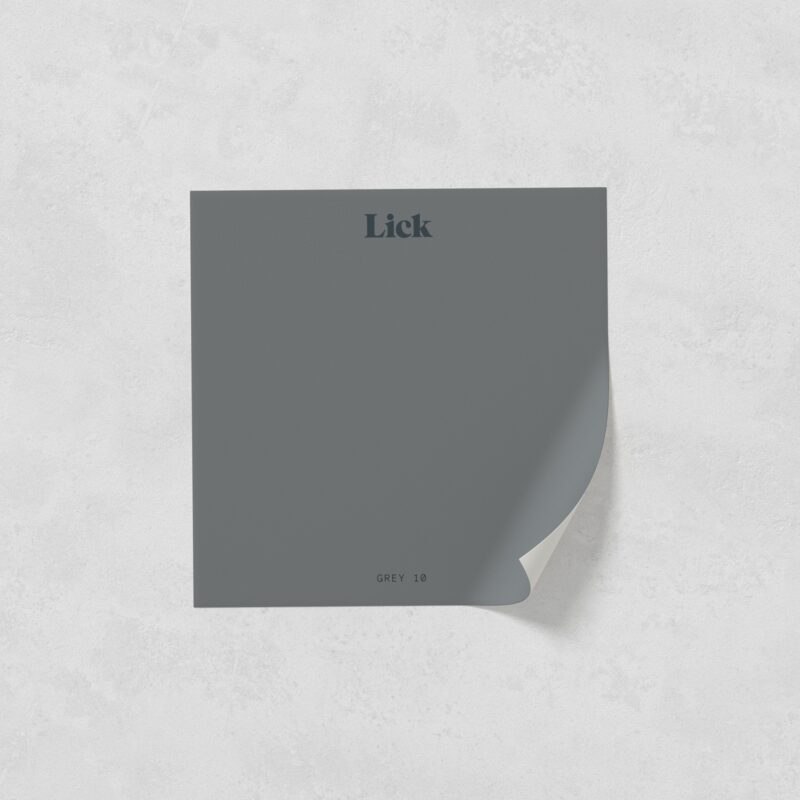
The best dark grey paint
If you’re wanting a darker look, Grey 10 is definitely the shade for you. Its cool undertones give an impactful and sophisticated feel to any space and this is definitely a colour that will stand the test of time.
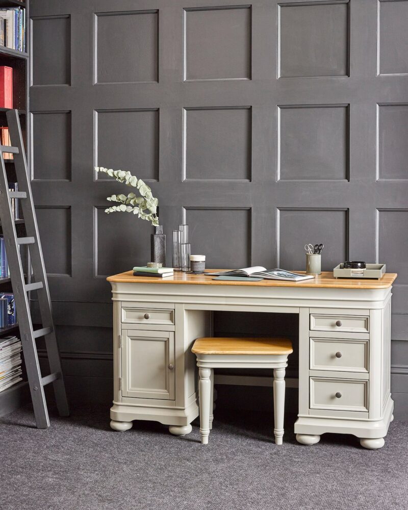
The best way to style this grey wall paint is to complement it with light grey tones in soft fabrics, like our Morgan sofa range. You could also choose wooden furniture with grey tones, like the solid oak Willow range. Read this blog for a comprehensive guide on how to decorate with grey.
A gorgeous greige
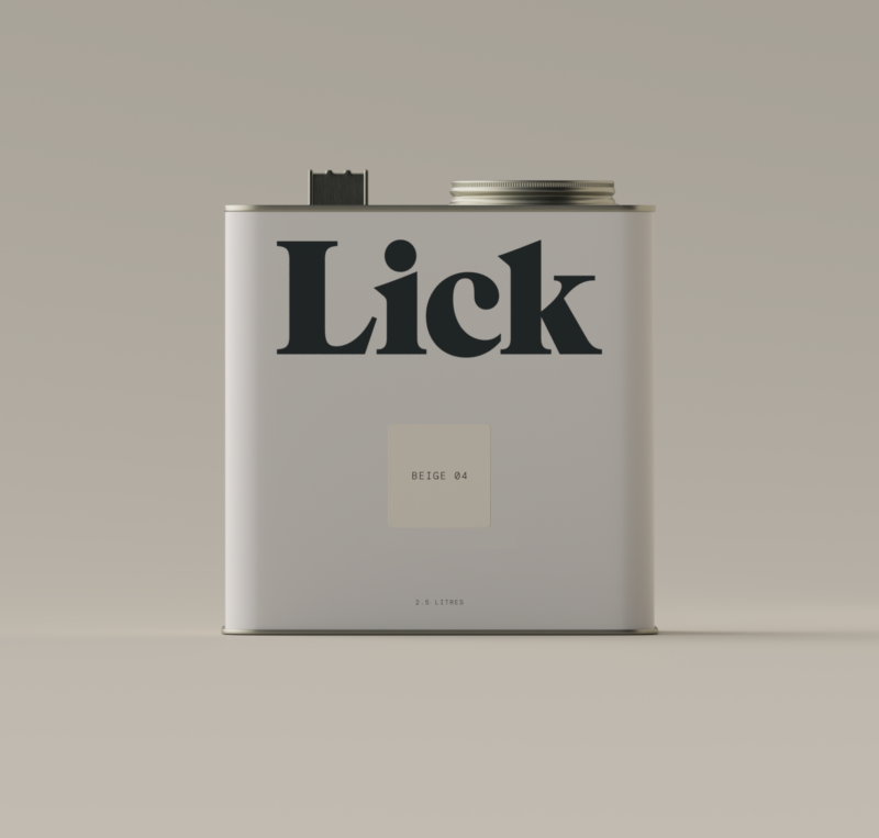
Greige is a famous neutral in between grey and beige, and is the perfect choice if you’re not sure which to go for. There are two greige paint colours, Taupe 01 and Beige 04, in the collection and both are warm tones which will give a chic and elegant finish to any room.
To style these greige shades, stick to warm natural woods like our Original Rustic range, for that cosy farmhouse feel. These neutral shades can also work as a beautiful backdrop to brighter tones, so if you have colourful curtains and fabric chairs or striking artwork you want to incorporate, these are the perfect shades to pair with.
Hove double bed | @ourhomemadeofthree
Finally, we can’t share our pick of these timeless neutrals without featuring Kelly Hoppen’s favourite. As she put it, ‘if I had to pick a favourite, it would have to be Beige 05, it is a beautiful soft linen shade which pairs so well with fabrics.’
To style this colour in your home, embrace the natural tones and fill your room with real oak furniture. The wood textures in oak furniture, especially those of the Parquet range, will perfectly compliment the earthy hues in this shade. Finish the space off with some dried grasses to bring the outside in and you’ll have your very own calming oasis.
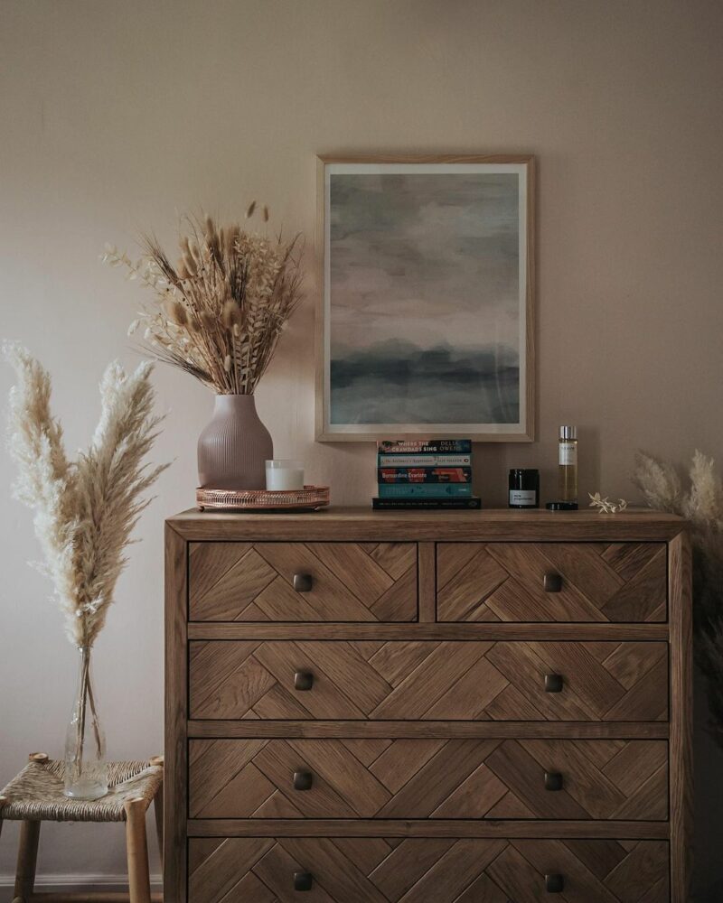
Parquet chest | @thelightshesees
And those are our top picks of the Kelly Hoppen x Lick range. If you’re still trying to decide on paint colours, check out this other blog post from Lick on how to choose the best paint colours for a soothing sleep.
We’d love to see how you style these timeless neutral paint colours! Tag us on socials with the hashtag #OakFurnitureland, and don’t forget to follow our Instagram for more inspiration.