
With National Pink Day taking place in June, there’s no better time to celebrate one of interiors’ most enduring colours. While pink has long been a favourite in the home, today’s take is more varied than ever, spanning everything from barely-there blush tones to rich raspberry shades.
These modern interpretations are no longer confined to children’s rooms or ultra-feminine spaces. Instead, they’re being used to bring softness, character, and depth to interiors in a way that feels fresh and easy to live with. Whether you prefer soft pastels or bolder berry hues, this classic colour offers endless possibilities for creating a home that feels both stylish and inviting.
Paired with oak furniture, tactile fabrics, and warm neutrals, it can feel elegant and timeless. Introduced through accessories, artwork, upholstery, or paint, it’s an easy way to refresh a space with colour and personality.
The pink trends shaping interiors in 2026
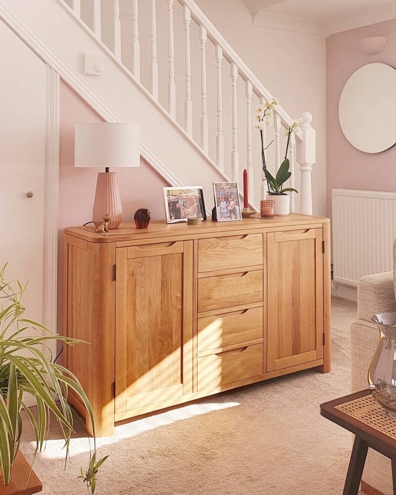
Romsey large sideboard | @herandhers_
Rather than being defined by a single hue, today’s trend is centred on creating atmosphere. On one side are delicate, powdery tones such as blush, ballet pink, and dusky rose, which bring a calming, understated feel to interiors. These lighter hues work beautifully with natural oak furniture and warm neutrals, creating spaces that feel restful and refined.
Alongside this, richer pinks are making a comeback. Berry reds, raspberry tones, and deeper shades are being used to add character and playfulness without overwhelming your room. Layered with creamy neutrals and textured finishes, they offer a modern alternative to classic red, bringing a sense of optimism to everyday spaces.
Together, these palettes reflect a growing desire for homes that feel comforting, expressive, and full of personality.
Why pink works so well in modern interiors
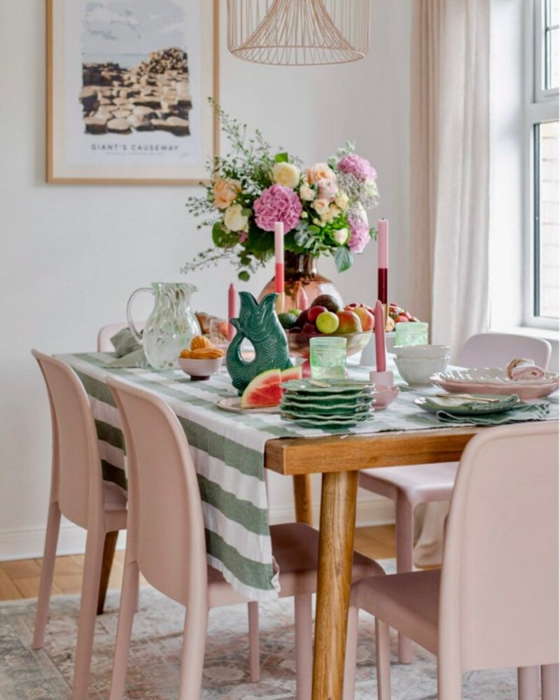
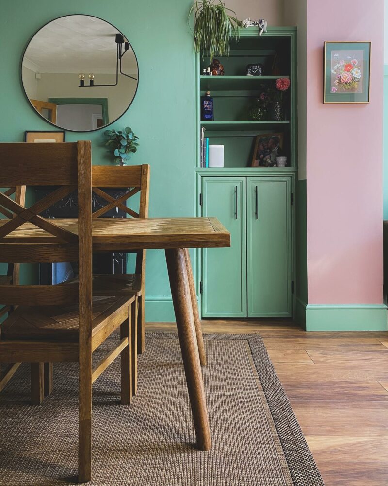
Parquet dining table | @yellowbrickcourt
One of the reasons pink remains popular is its adaptability. Depending on the tone, it can feel cocooning and relaxed, fresh and contemporary, or elegant and understated.
Unlike some stronger colours, it layers beautifully with an array of natural materials such as oak, acacia and marble. This makes it particularly easy to incorporate into existing schemes, whether through wall colour, soft furnishings, or decorative accessories.
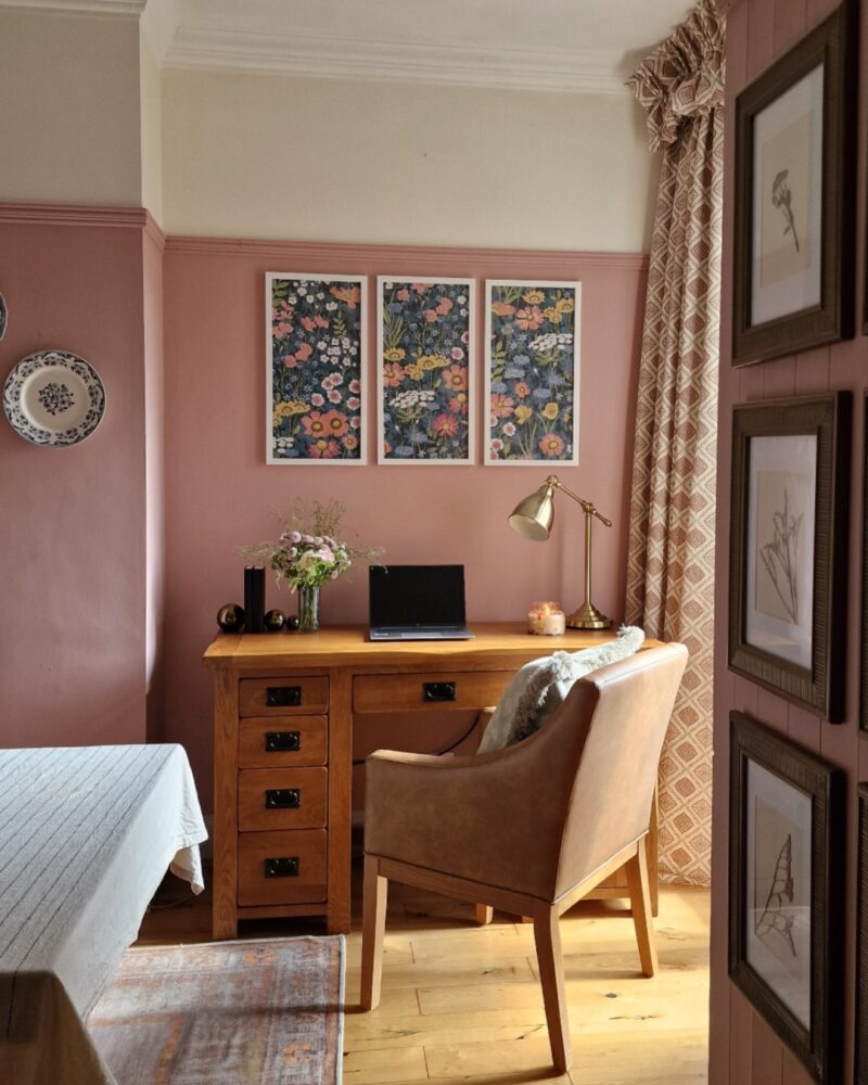
Original Rustic desk | @indigo_casa
It also bridges the gap between neutrals and colour, adding subtle interest without dominating a room. If you’re looking to experiment with this colour in a way that feels timeless rather than trend-driven, this shade is an ideal choice.
How to style pink bedrooms
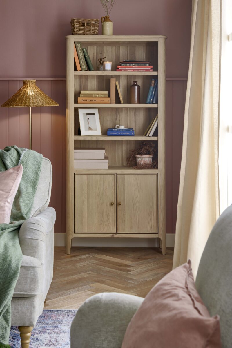
Parquet 5-drawer chest | @athumberfourteen
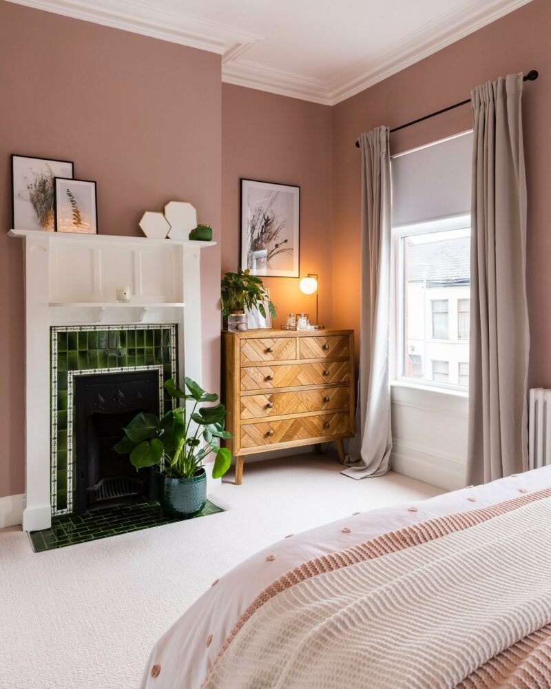
Blush and rose-toned palettes remain a popular choice for bedrooms thanks to their calming qualities. Delicate dusky hues create a restful backdrop, while warmer tones add depth, without feeling overbearing in your soothing space.
Pair soft-toned walls with wooden furniture, crisp white bedding, and layered textiles to create a sleep sanctuary that feels both relaxing and sophisticated. Pillows, throws, and wall art can help build the colour story too, in a subtle way.
Pink living room ideas
This palette is no longer reserved just for bedrooms. In living areas, gentle tones provide an easy-on-the-eye backdrop that works beautifully alongside light oak and textured upholstery.
If painting walls feels like too much commitment, introduce the colour through cushions, rugs, lighting, and ceramics. Layering different styles, shapes, and fabrics helps the look feel grown-up and refined rather than overly matchy.
Which colours go with pink?
Parquet dining table | @hausfifteen
One of the reasons pink remains so popular is its ability to work alongside a wide range of colours. Explore a selection of our top colour combinations:
- Warm neutrals – oat, ecru, taupe, mushroom, and soft beige, as seen in our Henley range, create a calm, sophisticated palette that feels timeless and easy to live with.
- Natural wood – oak furniture complements light and dark pink tones beautifully, thanks to its warm undertones.
- Green accents – muted greens such as sage, olive, and eucalyptus provide a fresh, nature-inspired contrast that works across both traditional and contemporary interiors, especially green sofas.
- Earthy hues – terracotta, clay, cinnamon, and chocolate brown add richness and depth, creating a more contemporary interpretation of pink interiors, brought to life with our Nova and Zara sofas.
- Berry-inspired pairings – layering blush tones with raspberry, berry, or muted red accents creates a tonal look that feels playful yet refined. This approach works particularly well through textiles, artwork, and tablescaping.
How to style stronger pink shades
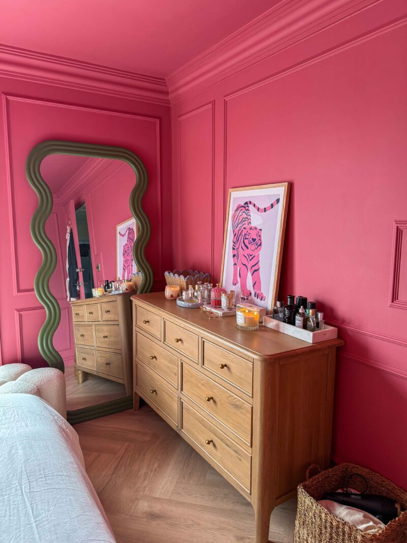
Newton chest of drawers | @bygemmma
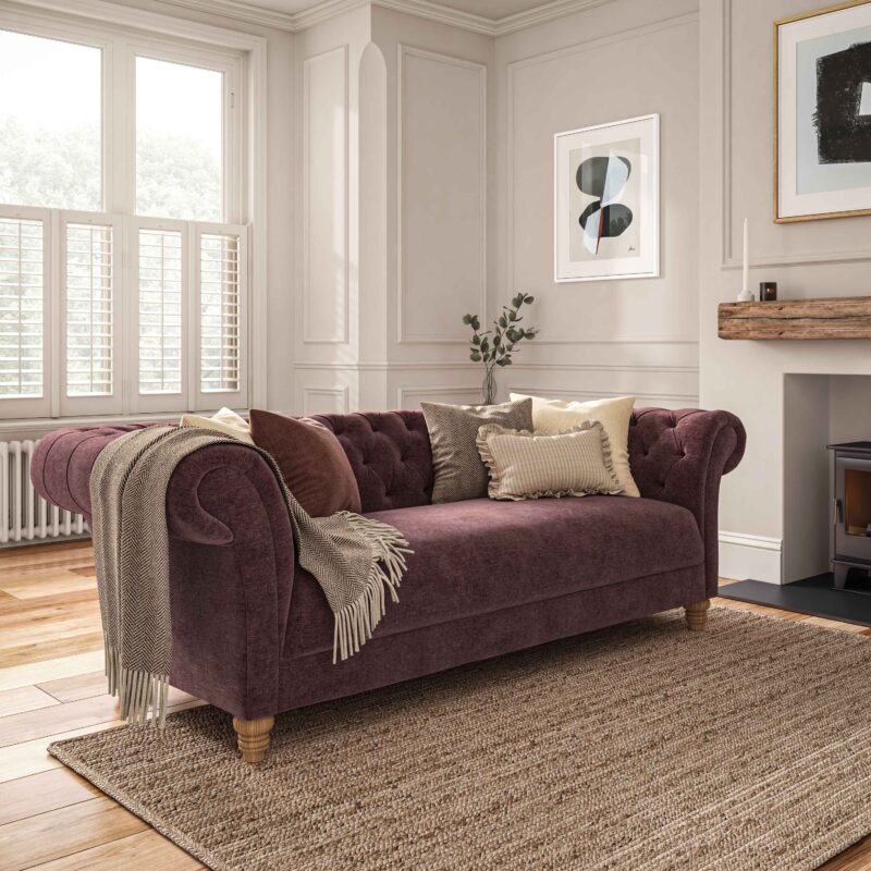
If you’re looking to create a bigger statement, richer tones can bring energy and character to a room while still feeling sophisticated. Raspberry, hot pink, and rose-red shades work particularly well when balanced with natural wooden flooring and furniture.
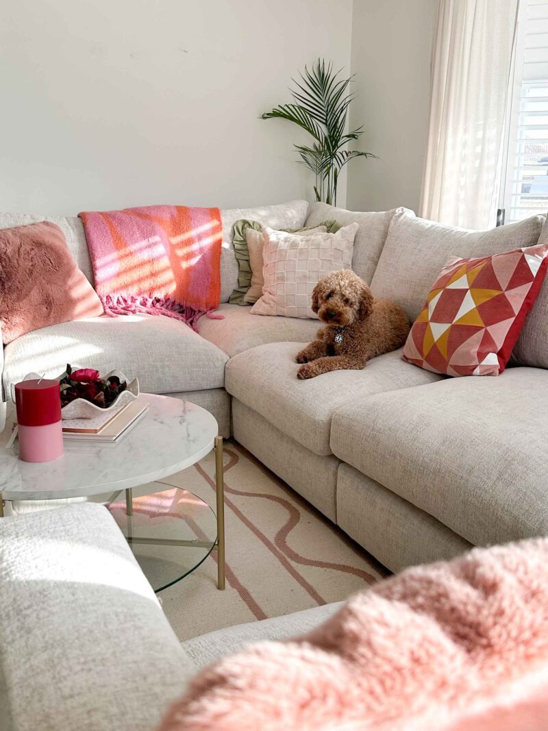
Malvern u-shape sofa | @renovationliving
Try introducing these stronger colours through pops of colour in your accessories before committing to larger pieces or wall colours. Striped and patterned textiles, glossy ceramics, and layered soft furnishings like rugs are an easy way to embrace these energetic tones, creating a look that feels fun yet considered.
The key to decorating with pink
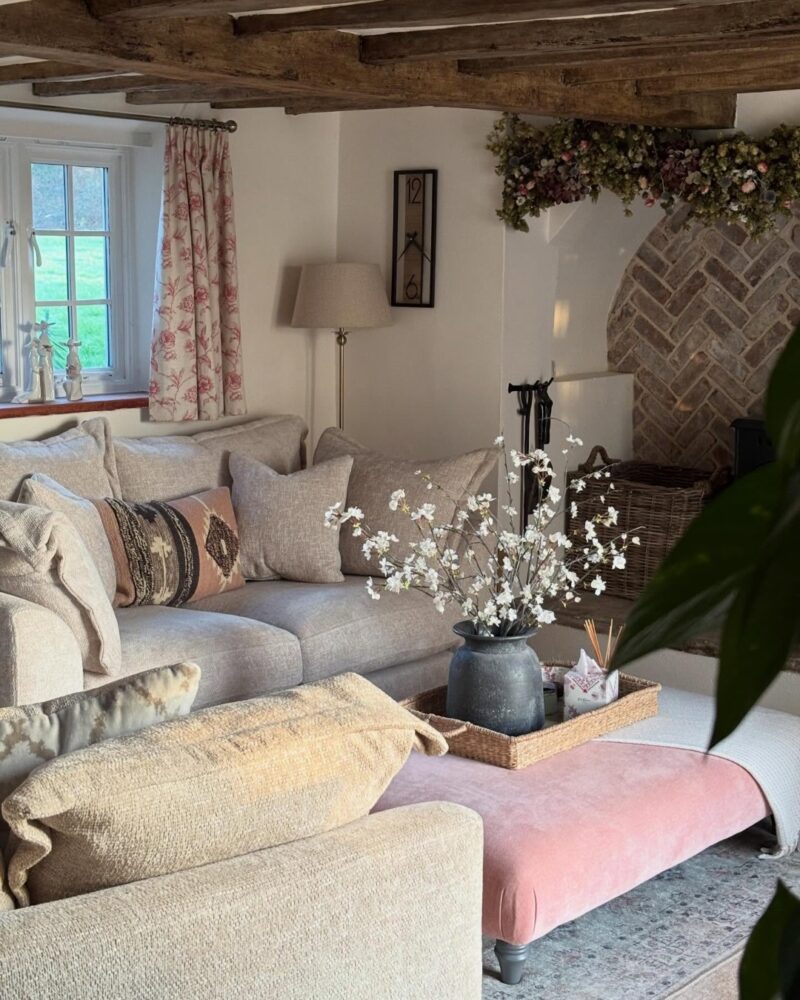
Dewsbury sofa | Ashby footstool | @our_terrible_house
Overall, the easiest way to decorate with pink is to view it as a supporting colour rather than the main hero. From calming powder tones to vibrant hues, today’s palette offers something for every style of home.
We’d love to see how you’ve styled pink in your home. Share your photos and videos with us on Instagram or TikTok using #OakFurnitureland #GrowYourHome.