Pantone Colour of the Year is back. This year, Pantone has announced its colour of the year as Classic Blue. Inspired by the sky at dusk, this resilient shade of blue has reassuring calm and peaceful qualities.

If you’re looking for a shade that adds an air of tranquillity to your space, here’s how to incorporate Classic Blue into your home design.
Classic Blue living room
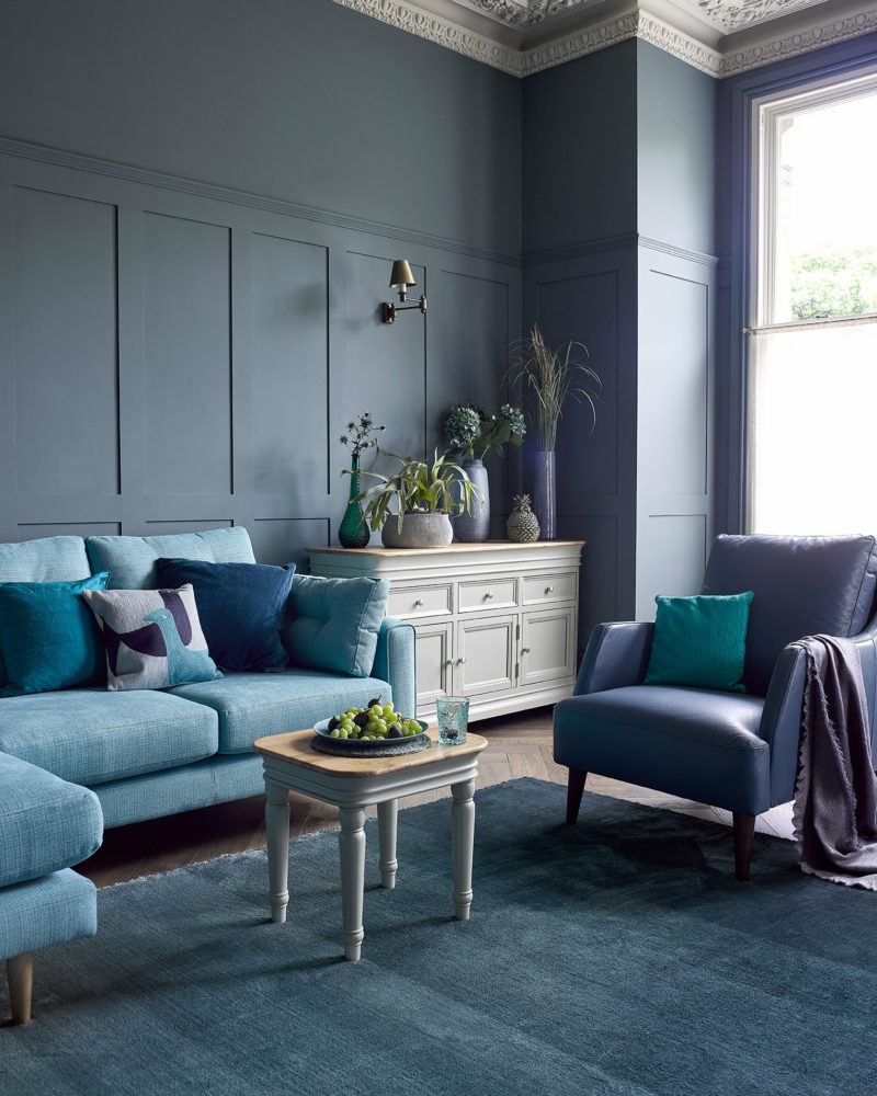
Brighton corner sofa | Brindle sideboard | Brindle side table
If you’re not afraid of colour, this is the perfect shade to use in your living room and layer with complementary blue hues to create a moody and inviting space. Use Classic Blue on the walls or find a statement piece in a similar shade and accessorise with teal and navy. The key to adding depth and avoiding everything looking the same is to incorporate textures. Try combining a few different materials around the room, for example, using the natural sea spray blue corner sofa and velvet cushions.
Classic Blue can be used more sparingly by adding pops of colour around the room. Find objects like scatter cushions, frames, vases or accent furnishings, and pair with lighter and more neutral tone pieces you may already have. Layering tones in a similar blue will give you the flexibility and creativity of changing up your living room without having to commit to painting the walls.
Classic Blue dining room
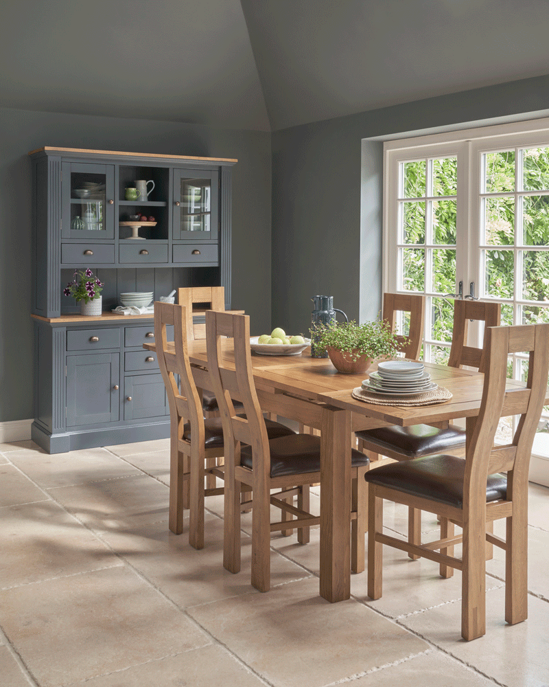
Highgate dresser | Dorset dining table
If you like Classic Blue but would prefer a muted shade in your home, you could mix in grey or opt for an inkier shade and use on your walls or painted piece of furniture. Our Highgate dresser would be a great introductory piece that would work a Classic Blue or inky tone. Blue and neutral tones go hand in hand which makes it easy to match with lighter neutral shades.
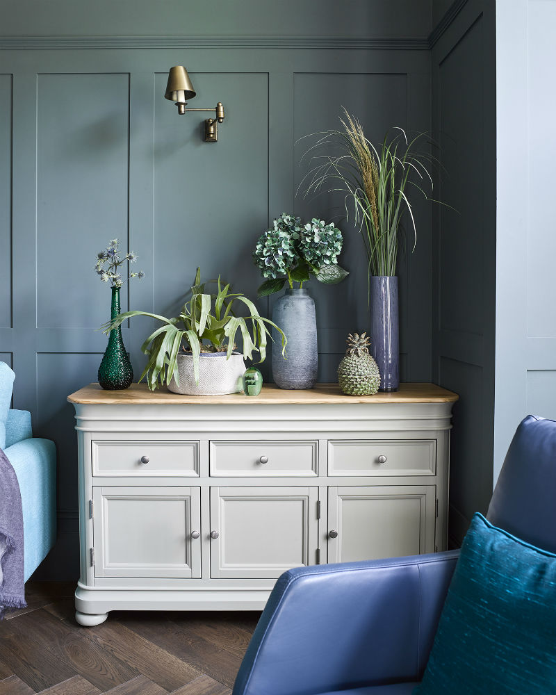
If you’ve chosen a statement wall in a deep hue, use natural furniture like our Copenhagen sideboard to provide a sense of calm. A statement wall is a perfect compromise if you’re feeling apprehensive about an entirely blue room. Stylish accessories like pots and ornaments in varying shades of blue tie the scheme together without being overwhelming. Thanks to its natural undertones, blue also has a great synergy with plantlife, so the more plants the better.
Classic Blue bedroom
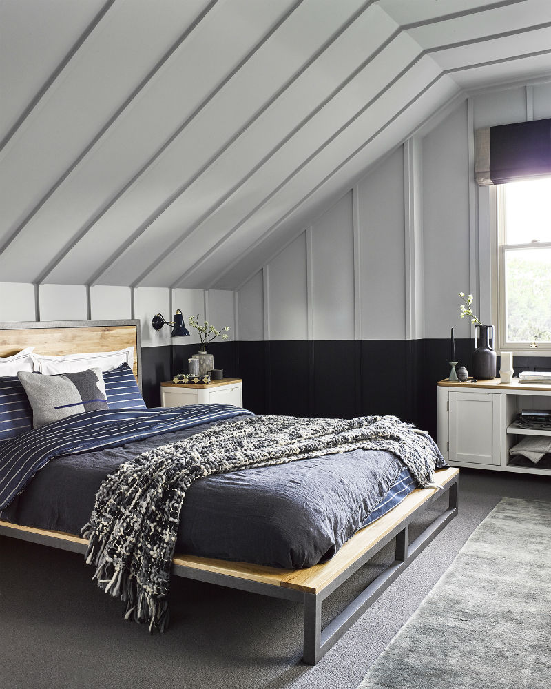
Brooklyn bed | Hove bedside table | Hove TV stand
Concerned about committing to a darker colour? The best way to know if Classic Blue is for you is to start with bed linens in the shade. If calm and contemporary is more your vibe, consider layering stylish industrial furniture like our Brooklyn bed with tranquil Classic Blue bedding. Add woven throws and contrasting cushions to promote a great nights sleep. If you want to keep your room light and airy, complete the look with soft white furnishings like the bedside table and TV stand from our Hove range.
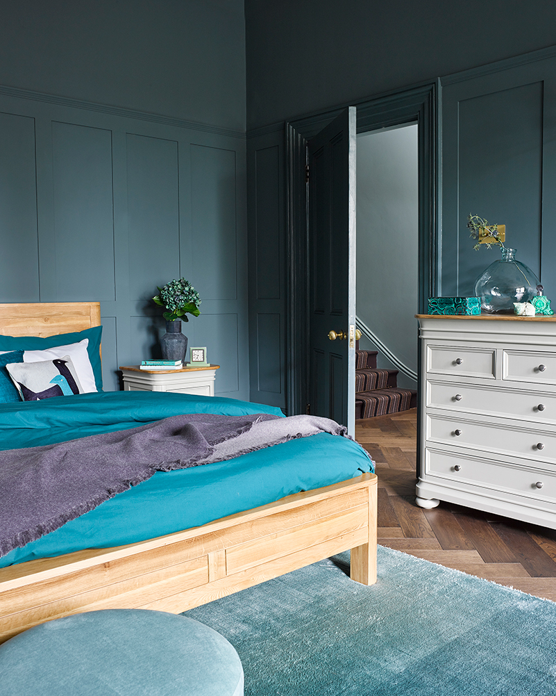
Romsey bed | Brindle bedside table | Brindle chest of drawers
The resilience of Classic Blue allows it to blend perfectly with most styles. Lift the room with furnishings like rugs and throws to add further colour and texture, and bring in natural touches like flowers on the chest of drawers or bedside table. Pick contrasting styles of furniture like our Romsey bed and painted Brindle range to bring balance and cohesion to the space.
Now it’s your turn. Are you a fan of Pantone’s Choice for Colour of the Year? If so, how will you be using it in your home this year? Let us know how you’re styling it in your home using #OakFurnitureland on social media.